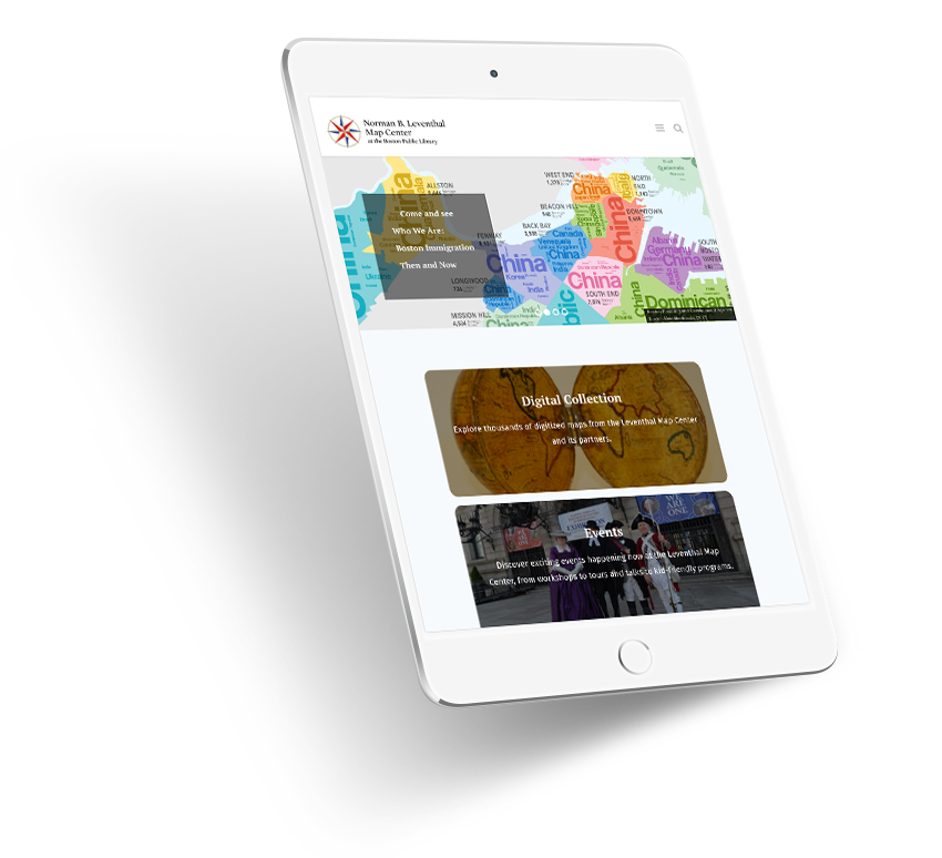
Leventhal Map Center at the Boston Public Library
Clean design, simple typography, and strong composition — particularly on library sites and other resource-intensive or archive-style websites — are paramount to a successful user experience.
Information architecture and branding can be a challenge for large organizations that include partnerships, projects, and sub-brands. The site redesign of the Leventhal Map Center (LMC) at the Boston Public Library (BPL) is one such example.

The Leventhal Map Center is housed in and supported by the Boston Public Library. It has an extensive collection of maps and atlases which are showcased in exhibitions, used for education programs, and available online as digital maps. While the LMC has its own brand and brand guidelines, it works in tandem with the BPL.
During the discovery phase, we analyzed where the site would live. LMC’s current website domain had long been established as a separate URL from the BPL website, but we assessed the pros and cons of converting the site into a subdomain of BPL. In this instance, since they already had a recognized domain, the decision was made to continue using the separate URL setup. If they had no previous website (or very little web presence) then we would have strongly recommended creating a subdomain of BPL to help to grow their web presence, leveraging the Domain Authority of BPL instead of trying to start from scratch.1
The main focus of the LMC website is searchable online resources. As we prepared for the site redesign, in-depth user personas helped create the sitemap and information architecture so we could optimize the site for its most frequent visitors — teachers, researchers, and map enthusiasts. Easy-to-use and intuitive navigation is a key component to this site’s success. Educators know exactly where to head to for teaching resources and researchers and map enthusiasts can find a range of information in the Collections section. Interested in seeing an exhibition? There’s a link for that.

According to studies, 59% of website visitors frequently use the site’s internal search engine to navigate.2 A Nielson Group study on search shows that more than half of users go straight to the internal search box to find what they need online.3 While some disagree about the importance or usability of a search bar, studies show that the search box is an essential navigation tool for improved user experience, and has been given prominent placement on the LMC site.

A “scoped search” helps visitors target results from two specific areas of the LMC, achieving the most relevant results: the informational site and the map collections. Searching the site only narrows results to the Center’s website for practical information like the Board of Directors list or for digital maps and atlases. Separating the two areas helps users direct their search more efficiently, therefore yielding the most relevant results.
A side benefit of including a search bar on any site (aside from providing a great user experience) is to discover new keywords. Noting which words and phrases your visitors are inputting can give you insight as to what people are looking for. Doing so can be informative in revisiting your UX and navigation structure if necessary. It can also help you learn about new or overlooked keywords to target for organic SEO or PPC to help increase leads.
The generosity of LMC visitors helps the center support educational resources, exhibitions, educational programs, and conservation, and expand their collections. We prominently displayed the donate button in two locations – both in the navigation area and in the footer – for increased visibility. LMC offers several other ways to contribute in addition to donating, like adopting a map for restoration or volunteering, which are offered in the Get Involved main navigation link. Well-placed and prominent Call-to-Actions (CTAs) are integral for user engagement, while repetition doesn’t hurt either. Did I mention repetition?

Since the site relaunch, the Leventhal Map Center’s website Domain Authority increased dramatically from 30 to 52. This number indicates how a website is performing compared to similar organizations, including the ability to rank higher in search results. The redesign combined with some basic SEO considerations helped put the LMC back on the map.
1. In the debate between new domains or subdomains, the latter generally prevails for SEO purposes for new websites. Subdomains help create a unified brand and reduce confusion. It can also help rank content quickly as search engines can pass credibility from domain to subdomain.
Hero Image by John Phelan, CC BY-SA 4.0 via Wikimedia Commons