Watertown Free Public Library
“We performed extensive research in what we needed for a new website, gathering input from each library department. BI effectively delivered a site that met the needs of the library and the greater community. We are pleased with the results and have enjoyed our working relationship for several years now.”
— Leone Cole, Director, Watertown Free Public Library
The Watertown Free Public Library (WFPL) serves a diverse, technology-oriented community situated next to Boston with over 350,000 annual visits and 5,000 room reservations. The library has a gallery, cafe and programs for adults, teens and children as well as an extensive Project Literacy program.
WFPL spent months engaging stakeholders to come up with an extensive list of website features. This was narrowed down to a more manageable list that addressed patron’s needs.
The site was built for mobile and desktop devices and includes over 30 library specific features such as room reservations, book and media carousels, visitor registration, ADA 508 compliance, social media integration, calendars, a forum, multilingual translation, photo & video galleries and advanced search.
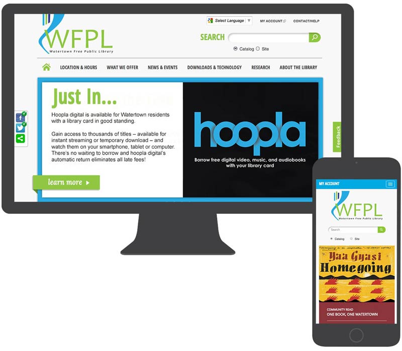
Libraries have served a civic role in communities for centuries. Now that public discourse is primarily online, libraries are offering services that meet people where they are.
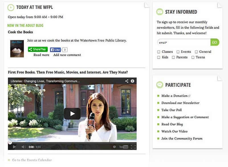
The WFPL site includes the first steps toward an online community that meets these needs. As shown in the example above: daily events, a call to action with multiple selections, a list of ways people can participate and a compelling video (‘Libraries: Changing Lives, Transforming Communities…’)
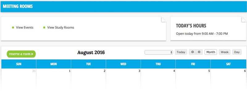
Making it easy for people to reserve meeting and study rooms was a key goal. Most libraries use third-party websites for room reservations. We created this capability within the WFPL site. This provides a more cohesive user experience (UX) as well as allows for customization specific to WFPL’s needs.
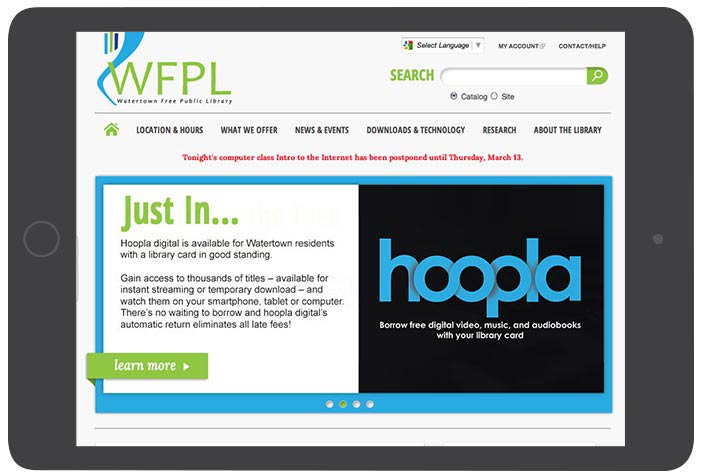
Homepage highlights shown above include:
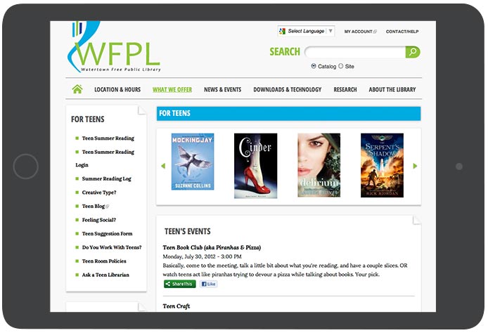
Some of the areas we focused on with the interior template as shown above include:
The site was well received by the client and the Watertown community. Thousands of room reservations were successfully made in the first year. The new site is a vast improvement in several areas, such as: the user interface design, user experience design, information architecture, usability, accessibility, content, and over 30 library-specific features.